Tuesday, March 31, 2009

Final Model

Clients : Rosalie Gascoigne (below ground plane) and Tracey Moffett ( above ground plane)

Arts : Something more by Tracey Moffatt

: Amber by Rosalie Gascoigne

Words : Unequal and Sign

Materials for stairs: Timber and Concrete

Textures used :


"Cosy", "smooth", "m
assive"


- The space on the ground plane and above ground are different in size. One is big and other is small. Both buildings have similar shape to emphasize their different unequal spaces. Apparently, the spiky cover of the building also has unbalanced sides. The stair which is used to go up to the above ground space is designed to show the word "unequal". As the step are not in order and the distance between them are different from one another, people will feel themselves unequal and unbalance as they walk up the stair.

- The space below the ground is designed based on the word "sign". The interior design shows the different shapes of the sign board. Mostly, i use circular shape to represent the main shape of it. Also for the stair, i use circle shaped steps.

-Three kind of textures has been applied to the building. For the above ground space, I use the texture which is cosy to create the comfortable workshop for the artist. The second texture which is smooth has been applied to the wall of the gallery to create clean and tidy look. And the third texture which is massive is used for the interior design to show the solid and massive weight.

-The materials i use for the stairs are concrete and wood. For the above ground stair, i would like to use concrete to show the solid strong steps. People will feel like they are floating in the air and sometimes they will realize that they might fall down and feel the unequal intensity upon their feelings. As the workshop below the ground is for the Rosalie who prefers natural materials, i would like to use wood to construct the stairs.

Sunday, March 29, 2009

Video


This video is taken from youtube. (http://www.youtube.com/watch?v=XBtma6YXAis)
I chose this video because it shows the animation and i think it's related to what i have to do later with my model.

Saturday, March 28, 2009

Developed Model

* Developed 2nd Model*


Words : Unequal and Sign

Clients : Rosalie Gascoigne (below ground plane) and Tracey Moffett ( above ground plane)

Arts : Something more by Tracey Moffatt

Amber by Rosalie Gascoigne

Materials for stairs: Timber and Concrete

Textures used : "Cosy", "smooth", "massive"


36 Textures


**********************************************************************************

Comment that i made on my friend's profile :http://randylxm.blogspot.com/2009/03/further-developed-model.html?showComment=1238587260000#c4646900834619045121

Sunday, March 22, 2009

Stairs and Sections


I tried to draw differnt kind of stairs to get some ideas of what style of stairs should be used.

---This is just a draft model of sections with stairs.
---Words: unequal and sign


************************************************************************************

--This is the first model with stairs.
--Words : Power and direct


--The stair steps of the above ground stair get bigger and longer at the top than the bottom. People might get a bit nervous and scare when they walk up the stair because the steps are short, thin and small at first. But as they walk up to the top of the stair, they will get confident and secured as the steps become larger, thicker and longer and in someway, their strength will become powerful and stronger.
-The stair for the below ground is simple and smooth. The steps has suitable distance between them and the stair has gentle slope. This will make the people to walk up and down comfortably.

************************************************************************************

*Artists' works and the materials they use*

The arts i chose are "Directives" by Rosalie Gascoigne and "Something More" by Tracey Moffatt.
Gascoigne normally uses material like wood, feather and wire and sometimes she uses road signs, texts, boxes and tin to create her pieces of art. "Directives" which she created for the 1999 exhibition has the size of 111×81.5cm and is made up of pieces of retro reflective yellow roadsigns which are put on the wood board. Most of the materials she used in her arts are just the basic elements that are found in surrounding. She is so creative that she can put the normal materials into something meaningful arts. There are also some arts which she uses different pattern and different color of the same materials.
"Something More" created by Tracey Moffatt is a 98 × 127cm sized photo which is for the "Something More" exhibition in 1989.I can see from the photo that the photo is delivering the emotions. The striking color and dark color are used in the photo to produce intensity and power. However, it doesn't seem to contain materials as it is just a photo. But looking at the photo and how it is taken, it is obvious that the photo is not just a photo but also something that is producing the strong meaning. We can see that both persons in the photos are female and from my point of view, the photo is revealing the power, inequality, weakness and control.

************************************************************************************
2 Sections of stair

Thursday, March 19, 2009

Sunday, March 15, 2009

Sections

Sketch:
Models:
1) Two words: Power and Direct
Material : Metal and concrete

2)

Monday, March 9, 2009

ARCH1101

Part-1


I have done some designs but they are so simple and do not contain much creativeness. So, I post a poem which I wrote last year for my literature assignment. The main themes are fire, water and wind. I figured out to write in a way to illustrate the nature of them and also good and bad side of each one. Apparently, the poem shows that things which are providing benefits can cause grief and pains without a reason sometimes. Not only in natural world, but also in human world, we will somehow face the negative outcomes from what we have highly expected to be great. And sometimes we have to accept that things have good aspect as well as bad.


I took this photo in Botanic garden in Perth. It shows the beautiful figure of a flower. The background is blurred which lets the foreground to be focused. So, we can clearly see the fantastic structure of the flower. Moreover, the photo is set on the single flower and that even more shows the beauty of it. Sometimes, a beauty of a thing can be really seen precisely when it is alone rather than mixed with others.


This is Guggenheim Museum designed by Frank Gehry which is located at the riverside in Bilbao, Basque Country, Spain. I was amazed when i saw this design. The use of the heavy material and the foramtion of great structure are breathtaking. The design is quite extraordinary as it uses titanium panels as the main material. The structure seems like a ship which goes perfect with the location. It is really remarkable to see the massive shining museum standing grandly in the city.


Part-2


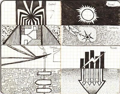
Moffat: Power, Control, Unequal


Hall: Chaos, Restrain, Distress


Gascoigne: Sign, Direct, Symbolic